beta.weather.gov
When hazardous weather strikes, people need fast, clear, and trustworthy information. The National Weather Service admirably provides this crucial service to the public. Unfortunately, its website, with over 90K pages of content, makes it difficult to find and understand critical information. 18F was brought on to reimagine and rebuild the site, making it more accessible and usable both to specialists and the general public. Though our efforts were cut short when 18F was shut down, we had built a beta site that showed what a user-centered weather.gov 2.0 could be.
I served as the design lead and principal product designer on a cross-functional team, leadng a design team consisting of a UX designer/researcher and a content strategist. As the product designer I wireframed flows and layouts, developed the visual style, and created multiple iterations of high fidelity prototypes for testing. Additionally, I contributed to the frontend development of our design components.
Client
National Weather Service
Contribution
Product design, prototyping, user research, frontend engineering, product vision
Designing for different audiences and data preferences
I worked with our content strategist and our UX researcher to iterate and find the right mix of content to display on the forecast page. We balanced the content so that visitors could quickly find the information they were looking for, without being overwhelmed or, conversely, feel like they were missing data.
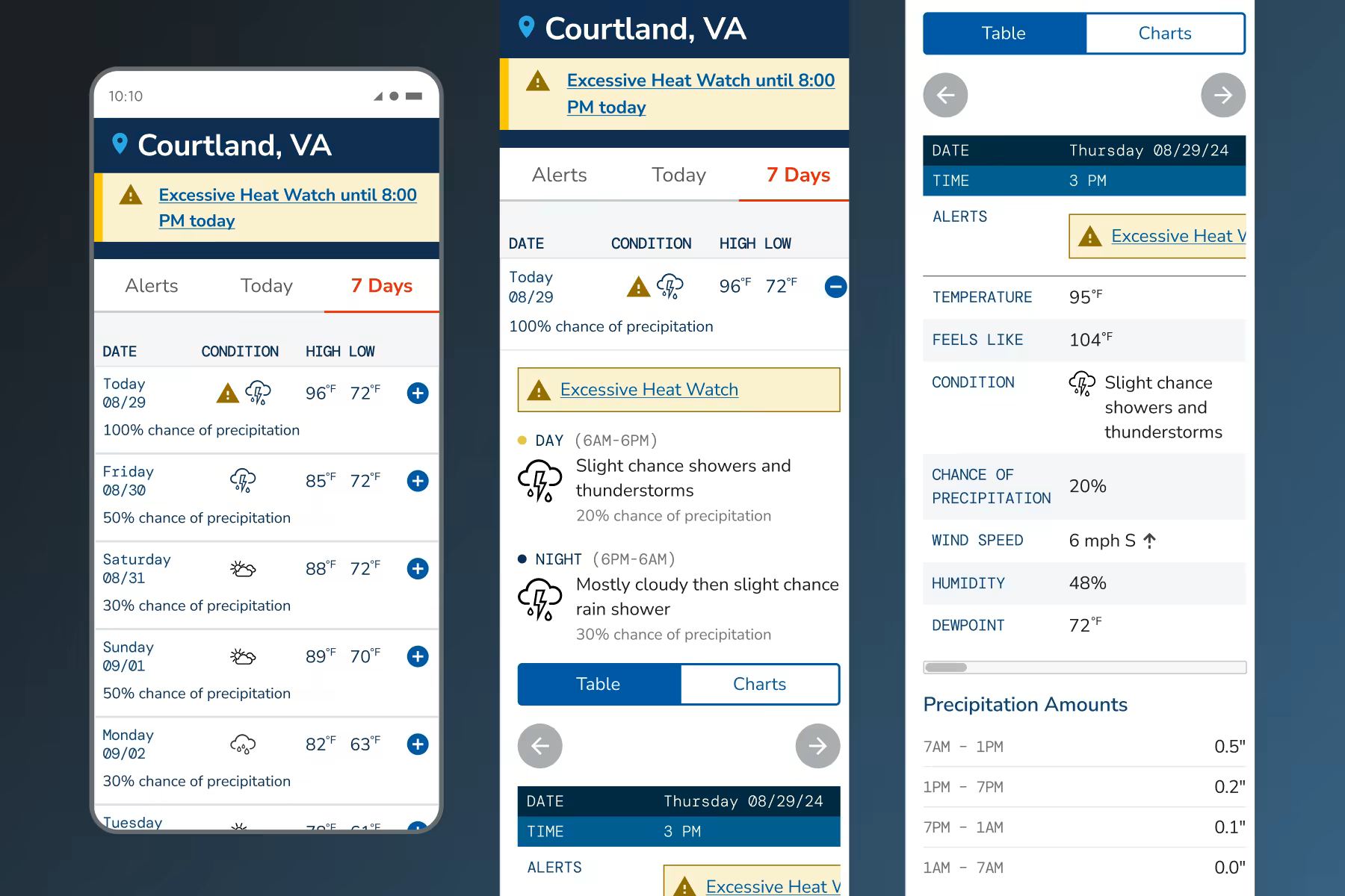
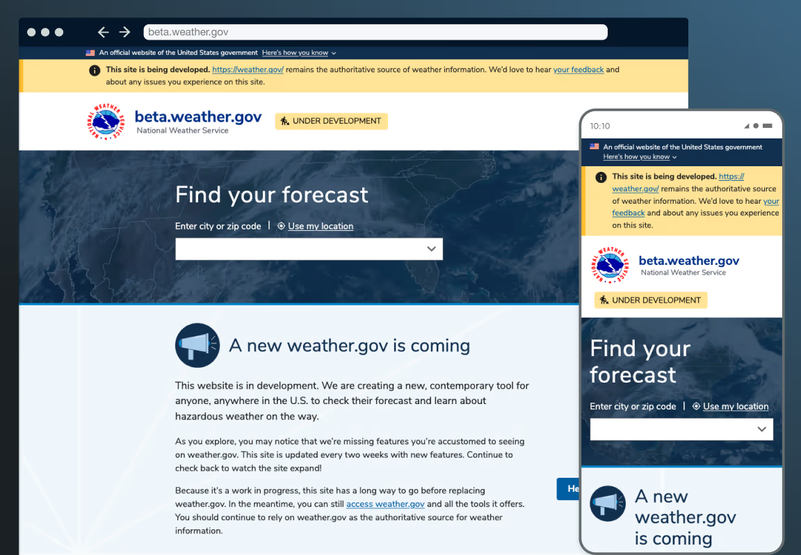
I took a mobile-first approach, based on research that many people would be relying on their phone to check weather information. We needed to make sure that content was easily digestible on smaller screens during hazardous weather.
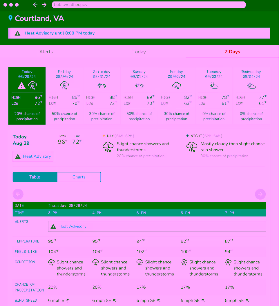
Though mobile-first, I designed the site to be responsive, intended to work on any size device visitors may use. This was particularly important given our wide audidence. Emergency response planners, for example, would be much more likely to use a desktop than a phone when a weather event occurs.
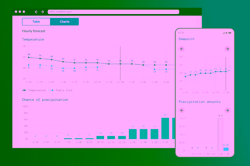
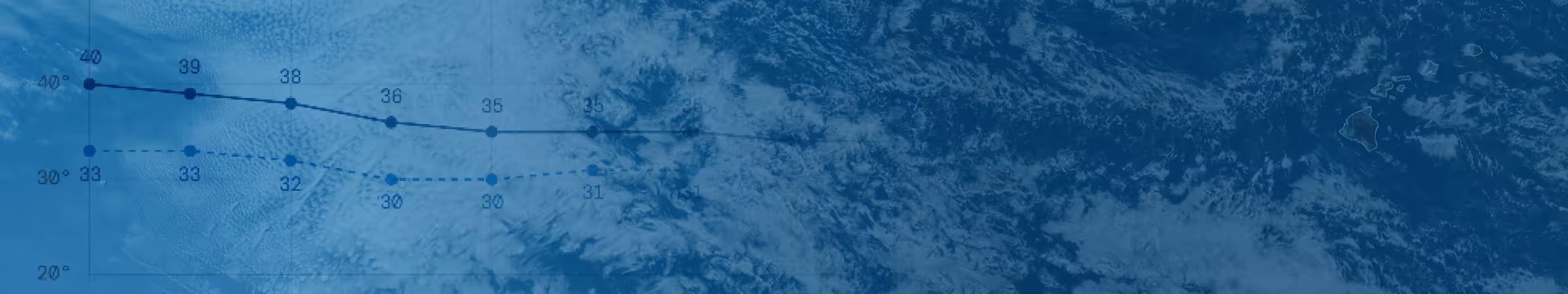
We included numbers, charts, and narratives because we learned people have a wide range of preferences for how, and how much, weather data they consume.
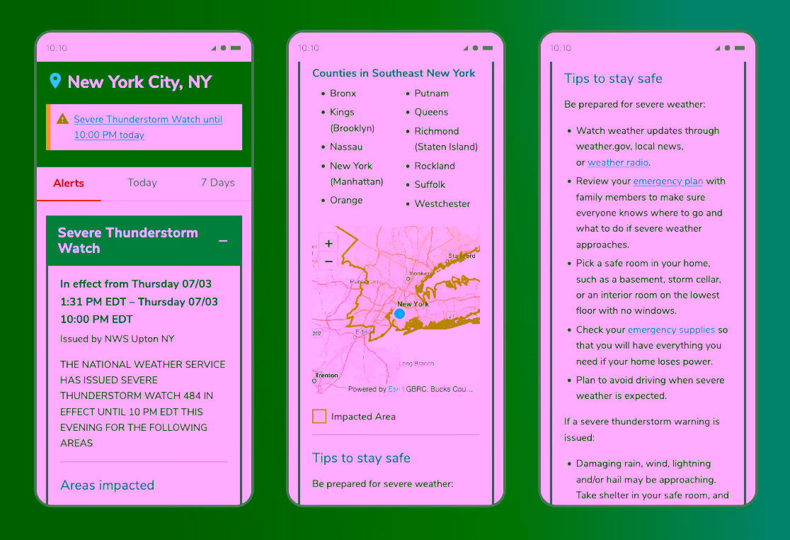
Prioritizing and distilling alerts
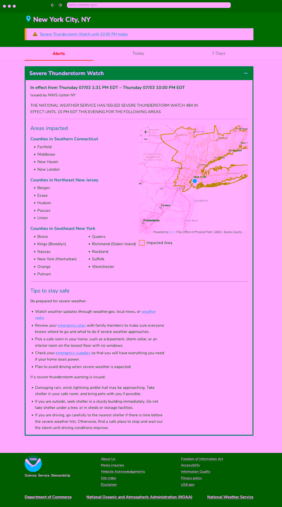
One of our key areas of focus was the alerts tab. We couldn't change the text of the alerts themselves. Instead, working with engineering, we were able to parse the text and create meaningful sections to help break up the information and make it easier to interpret.
Adding clear, effective visuals
In response to user feedback I created a new set of 25 icons to replace the ones we inherited. The icons would increase the visual interest and be easier for users to interpret. There were 4 variations of each icon for light and dark backgrounds and different sizing. This is a sample of some of the icons.
Though our team was continually working to make the site faster, I created a playful animation for when the site did take time to load. This was accompanied by static alternatives for users who prefer reduced motion. It was a chance to add a bit of delight to the user experience.
Iterating and documenting toward a working site
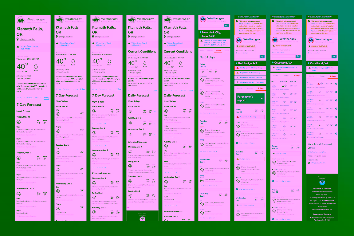
Our design team collaborated on many iterations, conducting multiple rounds of usability testing to reach a stage where users were able to quickly, easily, and accurately get the weather information they needed. We also conducted accessibility reviews to make sure the site was easily accessible and navigable by people who use different modalities to navigate the web.
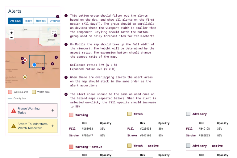
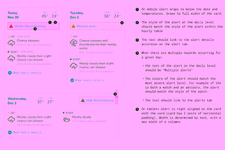
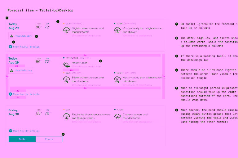
I documented all of the designs I created with clear and detailed annotations to help engineering implement new features and components. These served as a helpful reference both as we worked together on current features and as references for the future. For lower fideility wireframes, documentation also helped stakeholders understand how features would work.